A Logo born from fjord waters
Every element tells the story of Stavanger – where Nordic waters meet automotive excellence.
These colours capture Stavanger’s defining feature: pristine fjord waters. It’s a visual reminder that the company understands their environment and the unique challenges weather presents to vehicle care.
The prominent ‘S’ represents their commitment to local service. While Mobile Detailing appears as initials, Stavanger takes centre stage – they’re perfecting their craft in their customers’ neighbourhood.
The blue splash effect demonstrates ceramic coating’s water-repelling properties.
The shield symbolises the invisible armour they apply through waxing, polishing, and ceramic coating.
At the composition’s heart sits a premium car, validating that every vehicle deserves protection that matches its owner’s pride.
Stavanger-standard automotive care.
Digital craftsmanship meets user experience
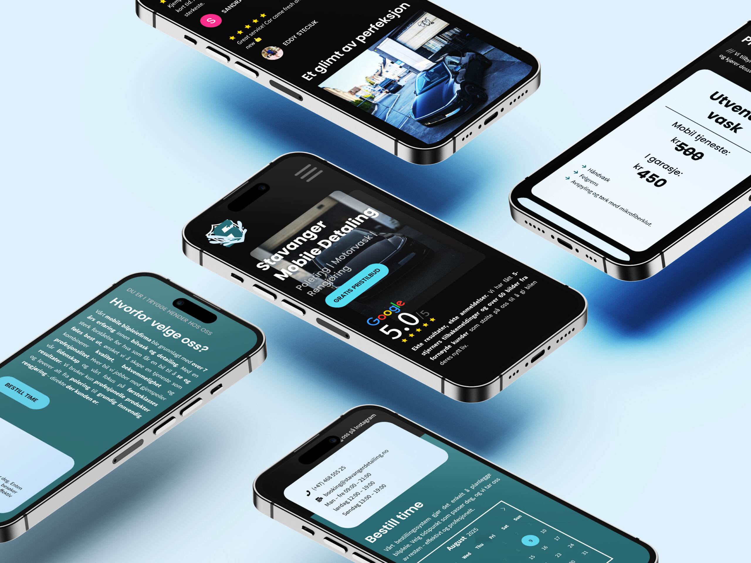
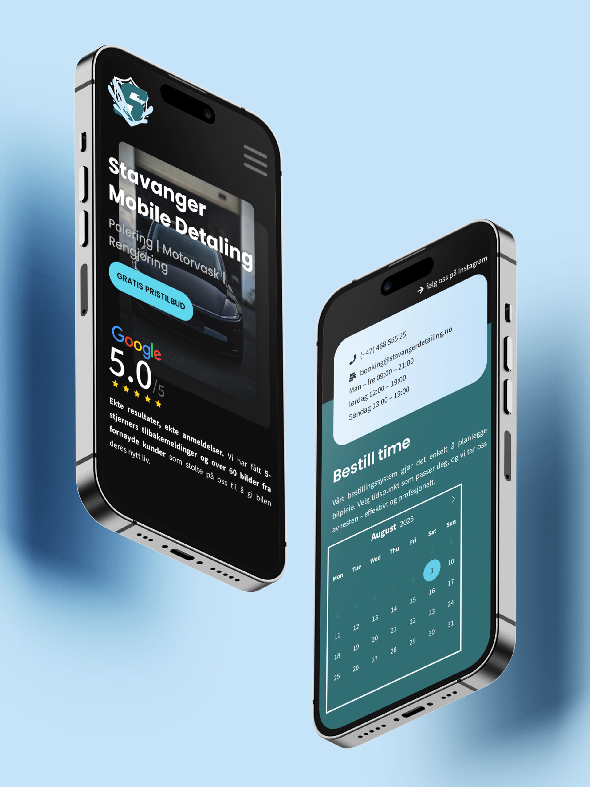
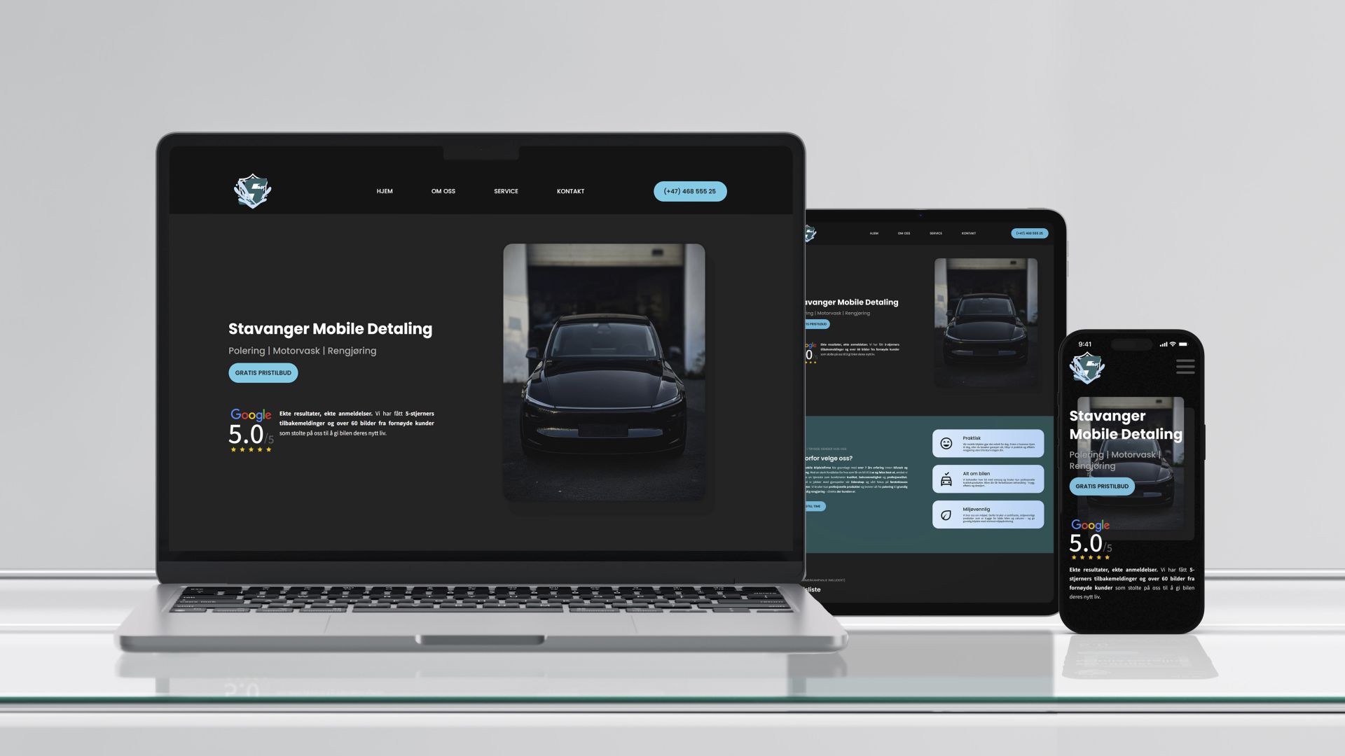
Every element serves the user experience – where simplicity meets digital efficiency.
No cluttered menus. No confusing pathways. Just three clear objectives: contact, showcase, book.
Every element serves a purpose, and nothing exists without reason.
Client contact takes priority – immediate access without barriers. The portfolio displays their work cleanly, letting results speak for themselves. Online booking transforms what used to be phone calls into quick, simple clicks.
Their Google Reviews sit front and centre because strong reputation deserves visibility. Trust that’s earned, not manufactured.