The brand identity for Stavanger Mobile Detailing connects their location with their craft—where Nordic waters meet automotive care excellence. The color palette draws directly from the city’s crystal-clear fjord waters, signaling that the company understands their environment and the specific challenges local weather poses for vehicle maintenance. It’s a deliberate choice that roots the brand in place while speaking to the protective, water-repelling services they provide.
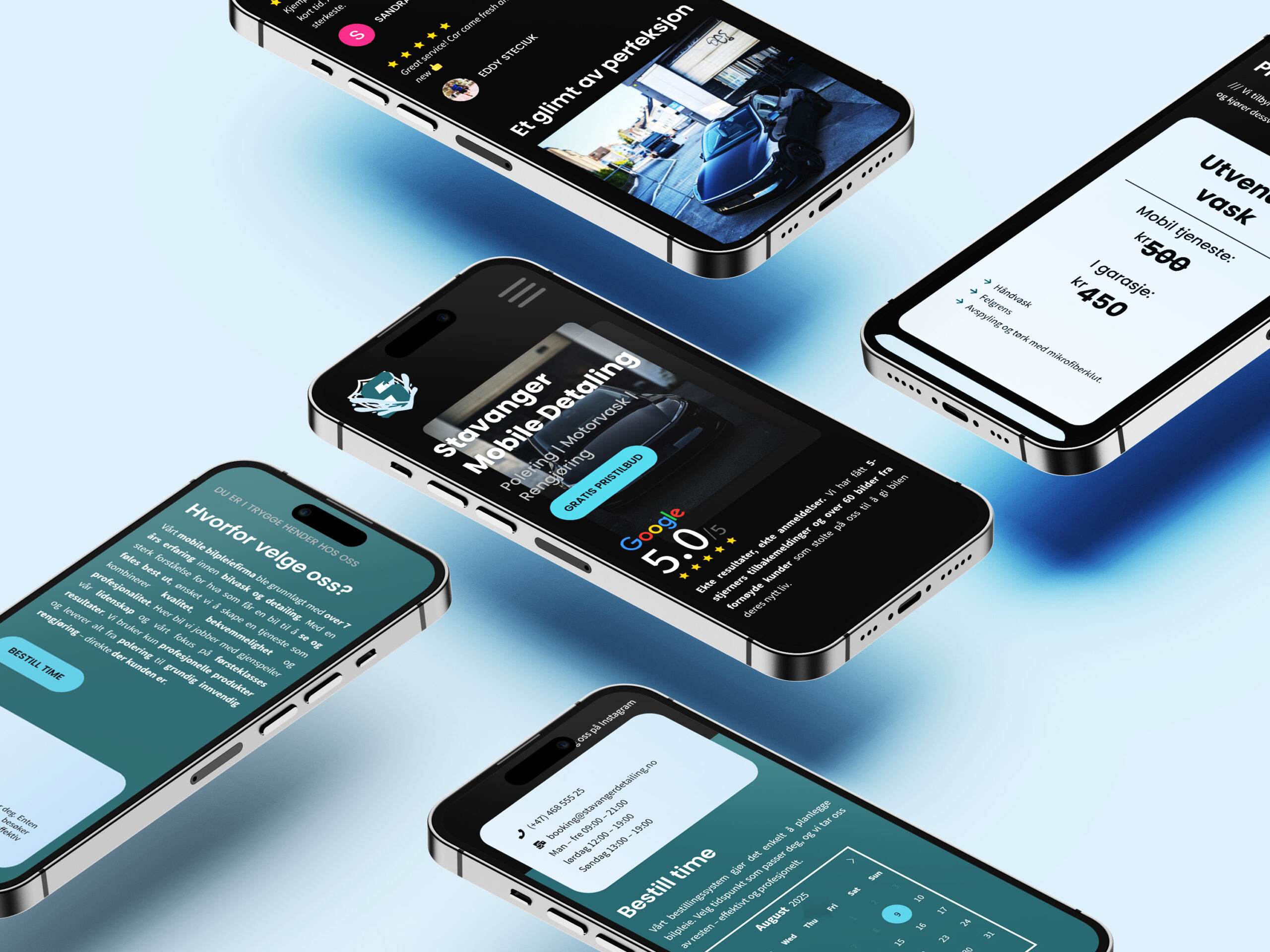
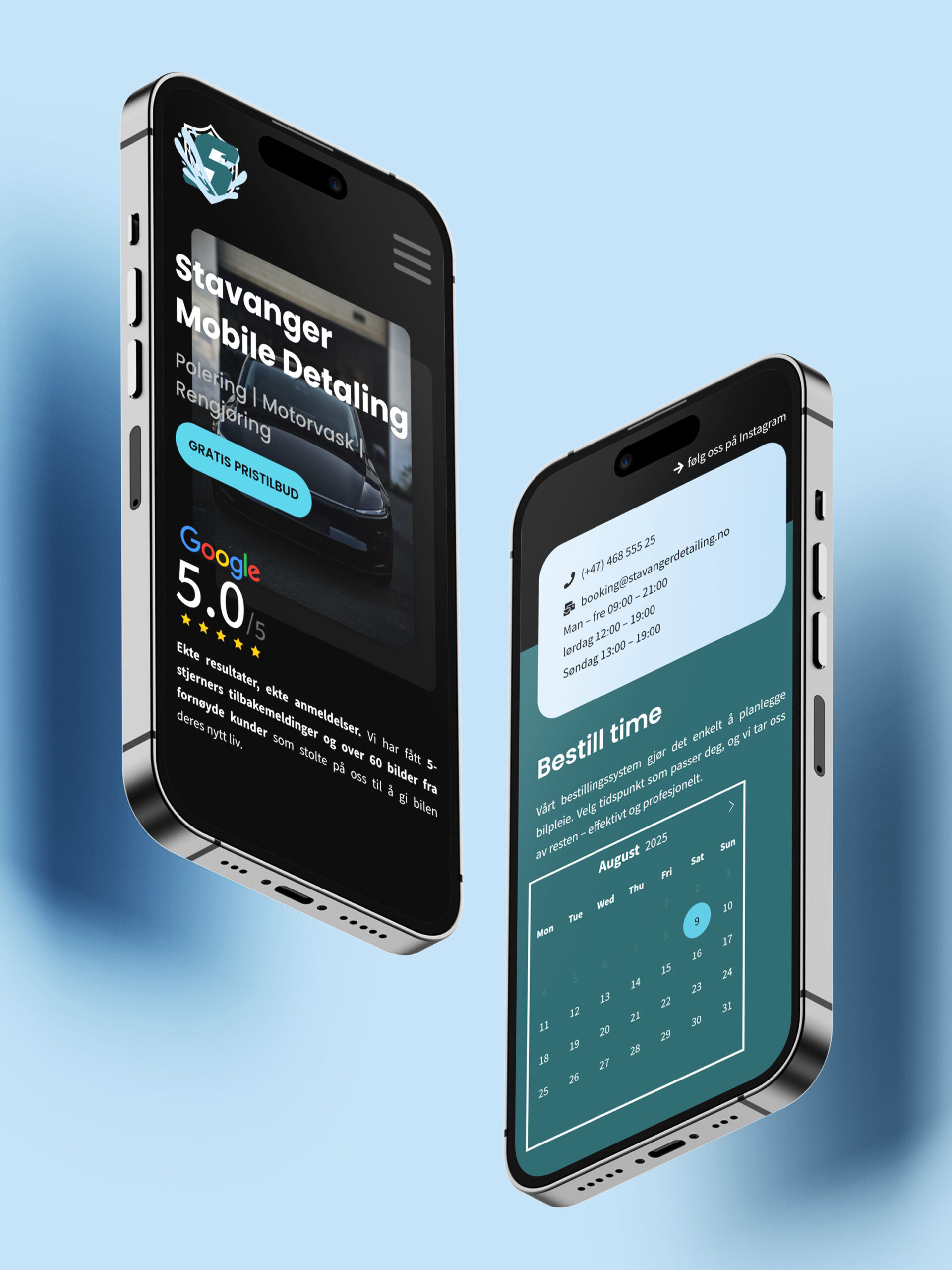
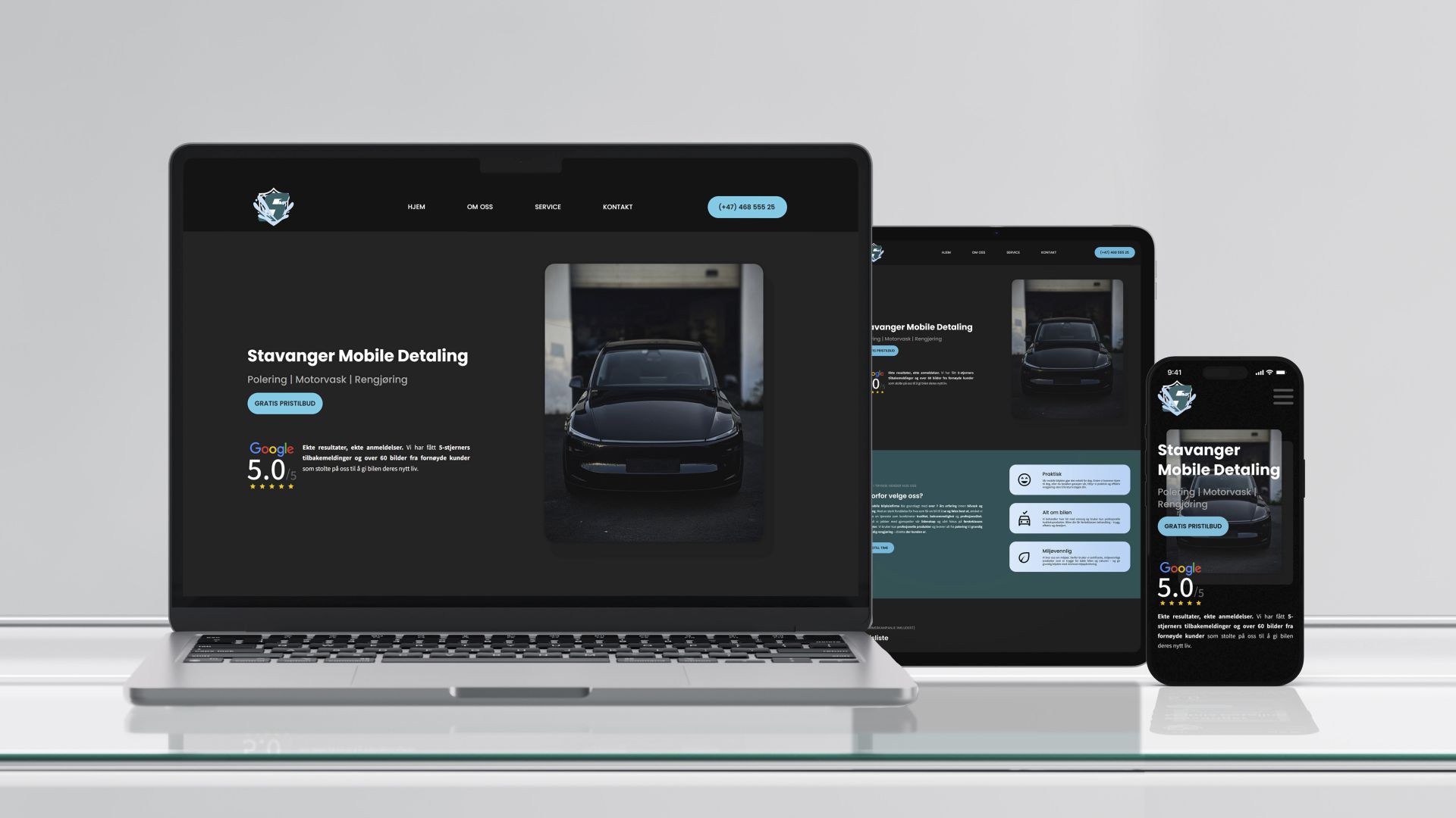
The site is built around a simple principle: make it easy for users to get what they need.
No cluttered menus or confusing buttons. Just three clear objectives: contact, showcase, book. Every element has a purpose—if it doesn’t serve the user, it doesn’t make the cut.
Client contact sits front and center with immediate access and no barriers. The portfolio keeps things clean and straightforward, letting the work speak for itself. Online booking replaces the old routine of phone tag with a few quick clicks.
Google Reviews are positioned up top because a strong reputation deserves visibility. When you’ve earned trust through consistent work, there’s no reason to bury it.
The result is a streamlined experience where every interaction moves users toward their goal. Nothing’s there just for decoration—it’s a digital presence that prioritizes function while still feeling approachable and human.